 |
||||||||
|
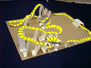
Based on the construction and
appearance, I would give this design a "C." Note: These drawings
do not address the write up portion of the
project. This one is improved by making the
cross tie lines bolder. Much better. The top side of the track
stands out from the bottom. The ride is easier to
visualize. Better yet. The top side of the track is one color
while the bottom side is a color other than the support
structures. Not only does the ride stand out but so does the
track from the supports. For track design. I would give this
an "A-." To make it an "A+," the hills could be more parabolic
for the free fall drops the track pieces could be made more
smooth. A thin piece of wire could be taped to the underside
of the track and shaped to give the track a smooth
appearance.
If you use or find this page useful or have any comments, please contact the author so maybe he'll do more. Author: Tony Wayne MAIN TABLE OF CONTENTS ... PHYSICS PAVILION TABLE OF CONTENTS <--PREVIOUS SECTION ... NEXT SECTION --> |
 |
A special thanks to VASTfor hosting our web site. |
|